
A normal candlestick is brutally efficient.
It tells you the open, high, low and close. Maybe you add a volume bar underneath. In four prices and one number, an entire minute of trading disappears.
A footprint chart tries to put some of that missing information back.
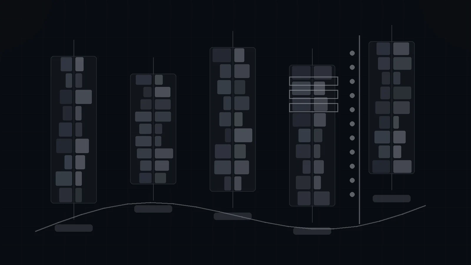
Instead of showing only the candle, it breaks the bar into price levels and displays how much volume traded at each level, often split into buying and selling activity. Suddenly you can see that a green candle contained heavy selling near the low, that a breakout printed enormous positive delta but barely moved, or that several adjacent prices showed extreme buy-side imbalance.
This is why footprint charts have become one of the most searched niche tools among futures and order-flow traders. TradingView now offers a native Volume Footprint chart, and platforms such as ATAS, Sierra Chart, Quantower and NinjaTrader have made similar data accessible to retail traders who once needed professional terminals.
But there is a problem.
The footprint looks precise enough to feel objective. It is full of numbers. Numbers invite confidence. Yet the way those numbers are classified can differ by data source and platform. Some tools use actual trade aggressor information. Others infer buy and sell volume from lower-time-frame price changes. Historical footprints may be less granular than recent ones. In decentralized markets such as spot forex, there is no single consolidated order flow at all.
So the real skill is not learning to stare at red and green cells. It is learning what the chart actually measures, what it only estimates, and which patterns contain information beyond what price already told you.
What is a footprint chart?
A footprint chart, also called a volume footprint, cluster chart, numbers bars chart or volume ladder, shows traded volume at individual price levels inside each bar.
The common Bid × Ask view places selling volume on one side of a price row and buying volume on the other. A Delta view shows the difference. A Total Volume view ignores direction and shows only how much traded. Some platforms also highlight the Point of Control, value area and price-level imbalances.
TradingView describes its native Volume Footprint as a chart that visualizes volume distribution across multiple price levels for every candle. It can display buy/sell volume, delta, total volume, stacked imbalances, value area and POC.
The first thing to understand: “buy volume” and “sell volume” are classifications
When traders first see a footprint, they often assume every green number represents a buyer and every red number represents a seller.
Every transaction, however, always has both.
If one futures contract trades, somebody bought and somebody sold. The footprint is trying to classify which side initiated the transaction more aggressively.
In a true aggressor model, a market buy that lifts the resting ask is classified as buyer-initiated. A market sell that hits the bid is seller-initiated. That distinction can reveal which side is crossing the spread to demand immediate execution.
But not every chart has identical access to aggressor flags.
This is where platform documentation matters. TradingView’s Volume Footprint currently categorizes volume using lower-time-frame price movement. If the intrabar closes above its open, its volume is assigned to buying; if it closes below, the volume is assigned to selling, with additional rules for unchanged bars. The most recent footprints can use very granular intrabar data, but older historical sections may rely on progressively higher intervals.
That does not make the chart useless. It does mean the numbers should not be treated as a perfect reconstruction of every market order that hit bid or ask.
Bid × Ask footprint
The classic footprint view shows two numbers at every price.
The left side generally represents volume classified as selling. The right side represents volume classified as buying. The exact terminology varies by platform.
Suppose ES trades at 6,500.00 and the footprint row shows 420 × 1,340. That means the chart is showing substantially more buy-side than sell-side activity at that level under its classification methodology.
The obvious conclusion would be “buyers are in control.” Sometimes that is correct. Sometimes it is exactly backwards.
If 1,340 units of aggressive buying hit a level and price cannot move higher, a large passive seller may be absorbing the demand.
This is the central lesson of order flow: aggression matters, but response matters more.
What is volume delta?
Volume delta is the difference between buying and selling volume.
A simplified formula is:
Delta = Buy Volume − Sell Volume
If a bar shows 12,000 units of buying volume and 8,000 units of selling volume, delta is +4,000. If selling is 15,000 and buying is 9,000, delta is −6,000.
Positive delta means buying pressure dominated according to the classification method. Negative delta means selling pressure dominated.
Cumulative Volume Delta
Cumulative Volume Delta, or CVD, adds each bar’s delta to the prior total.
TradingView describes CVD as an accumulated measure designed to provide broader context on the relationship between price and estimated buying/selling pressure.
If price rises while CVD also rises, the move has aligned directional pressure. If price makes a new high while CVD fails to confirm, traders call that delta divergence.
Divergence can be interesting, but it is not automatically a reversal signal.
A market can continue rising even with weakening delta because passive sellers retreat, liquidity thins or fewer aggressive buys are required to move price. Conversely, heavy buying can fail to lift price because a large seller is waiting.
CVD is a relationship, not a prophecy.
What is a footprint imbalance?
An imbalance compares buying and selling volume at neighboring price levels.
TradingView’s default imbalance threshold is 300%. In simplified terms, buy volume at one level must be at least three times the corresponding sell volume at the adjacent level for the platform to flag a buy imbalance. The mirror rule identifies sell imbalance.
The comparison is often diagonal because aggressive buyers lift offers at one price while aggressive sellers hit bids one tick lower.
A single imbalance is common and often meaningless. The more interesting pattern is a cluster.
Stacked imbalances
A stacked imbalance occurs when multiple consecutive price levels show imbalance in the same direction.
For example, three or four adjacent rows may each show buy volume exceeding sell volume by the platform’s threshold. Traders interpret this as concentrated directional aggression.
The popular trading rule is to treat stacked buy imbalances as support and stacked sell imbalances as resistance.
That idea can be useful, but the explanation is often overstated. You cannot infer from the chart alone that “institutions built a position here and will defend it.” The observable fact is narrower: a substantial amount of one-sided classified volume occurred across several neighboring prices.
Whether the zone matters later is an empirical question.
Absorption: the most important footprint concept
Absorption happens when aggressive orders meet enough passive liquidity that price fails to continue.
Imagine NQ pushes into the morning high. The footprint prints huge positive delta at the top. Buyers appear overwhelmingly aggressive. Yet the market advances only a few ticks, stalls and then falls.
The naive interpretation is “lots of buying, bullish.”
The order-flow interpretation is “lots of buying, but somebody sold enough to prevent progress.”
The second interpretation is often more useful.
This is directly related to the concept explained in The Kapital’s liquidity sweep guide. A push through an obvious high can trigger urgent buying from breakout traders and stopped shorts. If price cannot remain above the level despite that burst of demand, the failure itself becomes information.
Exhaustion
Exhaustion is different from absorption.
Absorption means aggressive flow is present but fails to move price. Exhaustion means the aggressive side itself appears to be disappearing.
Near the end of a down move, sell volume may shrink at successive lows. The market reaches a new extreme, but fewer participants are willing to continue hitting bids. If buyers then reclaim structure, traders interpret the pattern as seller exhaustion.
The danger is hindsight. Every trend eventually shows smaller prints somewhere. A trader needs a predefined location and confirmation rule rather than labeling exhaustion only after price reverses.
Failed auctions and unfinished auctions
Footprint traders often describe extremes in auction language.
A failed auction can refer to an attempt to move into a new price area that cannot attract continuation. Price probes an extreme, aggressive flow appears, and the market quickly returns.
An unfinished auction often refers to an extreme where both buying and selling activity remain visible rather than one side tapering toward zero. Some traders believe such prices are likely to be revisited.
I would treat that as a hypothesis, not a rule. Markets do not owe a revisit simply because a footprint pattern looks incomplete.
The broader auction framework is explained in The Kapital’s Market Profile guide. Market Profile emphasizes time and acceptance; footprint charts emphasize transactions and classified aggression. They are related views of the same auction, not interchangeable tools.
Footprint chart vs Volume Profile
Volume Profile answers: where did volume trade?
A footprint asks: how was that volume distributed inside each individual bar, and which side appeared more aggressive?
A session Volume Profile can tell you that 6,500 was the highest-volume price of the day. A footprint can show whether the move through 6,500 was dominated by positive delta, negative delta or absorption.
Profile is spatial context. Footprint is microstructure context.
Footprint chart vs Fair Value Gap
A Fair Value Gap is built from candle geometry. A footprint is built from volume information.
This distinction matters because traders often use FVG language to make claims about “institutional imbalance.” The Kapital’s Fair Value Gap guide explains why a three-candle pattern does not prove hidden orders.
A footprint gives more direct information about the transactions occurring inside the move. Even then, it does not reveal trader identity.
You may see aggressive buying. You cannot see a label saying “hedge fund.”
The TradingView data caveat most tutorials skip
This is the part that matters most to me.
TradingView’s footprint documentation explicitly explains that it categorizes volume using intrabar price direction and changes the historical granularity as lower-time-frame data availability is exhausted.
That means a screenshot can look more exact than the underlying methodology actually is.
Recent bars may use tick or one-second information depending on the plan and market. Older history may use one-minute or even higher intervals. If you are backtesting visual footprint signals across years, the data resolution itself may not be constant.
A strategy that depends on subtle 300% imbalances should therefore verify that the historical dataset is comparable across the test.
This is not a criticism unique to TradingView. Every order-flow platform has data assumptions. The important habit is to read them.
Centralized vs decentralized markets
Footprints are most intuitive in centralized futures because CME provides a defined exchange venue and consolidated contract volume.
Stocks are more complicated because U.S. equity trading is fragmented across exchanges, alternative trading systems and internalizers. A data feed may aggregate much of the market, but the trader should understand its coverage.
Spot forex is even more difficult. There is no single global exchange that records all EUR/USD transactions. A broker’s tick volume or liquidity-provider feed is a sample of the market, not the entire market.
Crypto depends on venue. A Binance footprint is Binance order flow. A Coinbase footprint is Coinbase order flow. A consolidated feed may combine several venues, but aggregation rules matter.
A practical footprint trading setup: failed breakout + absorption
One of the cleanest ways to use footprint data is not to predict a breakout, but to judge whether a breakout is succeeding.
- Mark a clear prior high before the session.
- Wait for price to trade through it.
- Observe whether delta expands aggressively.
- Ask whether price makes proportional progress.
- If heavy positive delta produces little extension and price reclaims the old range, absorption becomes plausible.
- Use the failed breakout structure—not the delta number alone—as invalidation.
This setup combines price location, visible order flow and a falsifiable response. It is far stronger than shorting simply because one cell turned red.
Prior high/low, VWAP, opening range, value edge or catalyst level.
Delta, imbalance and pace tell you who is demanding execution.
Did price actually move? Absorption is aggression without proportional progress.
Define structural invalidation and size the trade from the stop distance.
Stacked-imbalance continuation setup
The mirror use case is continuation.
Suppose NQ breaks from the opening range on a macro catalyst. The move closes above prior value, and several consecutive footprint levels show large buy imbalance. A shallow pullback holds above the stacked zone while delta remains constructive.
A trader may use the stacked imbalance as evidence that the move was supported by aggressive participation.
But again, location matters. The same imbalance printed directly into a major weekly resistance level may represent late chasing rather than fresh opportunity.
Delta divergence setup
A common footprint setup compares price with CVD.
Price makes a new high. CVD makes a lower high. Traders call this bearish delta divergence.
The interpretation is that the market reached a higher price with less aggressive buying than before.
That can precede reversal. It can also reflect easier upward movement because offers are thin.
The divergence becomes more meaningful when it occurs at a preidentified level and price itself begins to fail.
I would never trade CVD divergence without a price invalidation.
Why footprint charts can make traders worse
More information is not always better.
A footprint contains dozens or hundreds of numbers inside the same space where a candle contains four prices. That creates enormous opportunity for pattern mining.
After a losing trade, you can almost always find one imbalance you “should have seen.” After a winning trade, you can highlight the delta cluster that “confirmed” it.
This is a dangerous form of hindsight because the chart is too information-rich.
A useful footprint process therefore limits what you are allowed to look for. One or two patterns at one or two meaningful locations are better than interpreting every cell.
Footprint charts and stop placement
Order-flow traders sometimes place stops just beyond absorption zones or local footprint extremes.
The logic can be reasonable, but the same execution caveat applies as with any stop. A stop order is a trigger, not a guaranteed fill. Fast futures markets can move through several ticks before execution.
The Kapital’s guide to stop orders and slippage explains why the chart price and realized exit price can diverge precisely when volatility increases.
What markets are best for footprint trading?
Centralized liquid futures are the cleanest environment because contract volume is transparent and tick structure is well defined.
Common markets include ES, NQ, CL, GC and Treasury futures.
Liquid stocks can also be useful when the platform has strong consolidated data. Crypto can work if the trader understands which venue is being measured.
The worst use case is pretending that a partial or synthetic volume feed represents the entire market.
What settings matter?
Row size. Too granular and the chart becomes noise. Too coarse and meaningful differences disappear.
Imbalance threshold. 300% is common, but common is not the same as optimal.
Stacked levels. Requiring several adjacent imbalances can reduce noise.
Session definition. Futures traders should decide whether to analyze the full electronic session or regular U.S. hours.
Data source. This is more important than the color scheme.
How I would test a footprint strategy
Footprint strategies are harder to test than ordinary candle rules because the data are granular and platform-dependent.
I would define the setup as an event sequence rather than a visual impression.
Example:
- Price trades above the prior session high.
- Bar delta exceeds a predefined percentile of recent delta.
- Price extension beyond the high remains below a predefined ATR fraction.
- The next bar closes back below the old high.
- Entry occurs on the reclaim.
- Stop is above the sweep extreme.
- Target is fixed R or prior value.
Now absorption has a measurable definition. Without rules like these, “I saw absorption” cannot be tested.
Common footprint mistakes
Assuming positive delta means price must rise. Delta measures classified aggression, not effectiveness.
Calling every large print institutional. Trader identity is not visible.
Ignoring feed methodology. The numbers depend on data and classification.
Trading imbalance without location. An imbalance in the middle of random chop is usually just activity.
Using different row sizes until the chart looks clean. Parameter flexibility creates hindsight.
Overfitting stacked imbalance thresholds. A 250%, 300% or 400% rule should be tested rather than inherited from a platform default.
Watching too much. If every cell becomes a signal, the chart becomes a justification machine.
Do footprint charts give traders an edge?
They can give traders information that a candlestick alone does not contain.
That is not the same as guaranteeing an edge.
The chart is most useful for answering a narrow question: what kind of trading activity occurred at a meaningful price, and how did price respond to it?
If the location is irrelevant, more granular order-flow information may simply describe noise in greater detail.
I think footprint charts are best viewed as an execution and confirmation tool rather than a standalone prediction engine.
Footprint Chart FAQ
What does a footprint chart show?
It shows volume distributed by price within each bar, often split into buying and selling classifications, with optional delta, POC and imbalance information.
What is delta in footprint trading?
Delta is the difference between classified buying volume and selling volume. Positive delta indicates more buying aggression; negative delta indicates more selling aggression.
What is absorption?
Absorption occurs when aggressive orders fail to move price proportionally because passive liquidity on the other side is large enough to absorb them.
What is a stacked imbalance?
It is a series of adjacent price levels where one side’s volume exceeds the opposite side by a defined threshold, often 300% or more.
Are footprint charts accurate?
Accuracy depends on the market, data feed and platform methodology. Traders should read the documentation rather than assume every displayed buy/sell number is a direct exchange aggressor flag.
Is footprint trading better than candlesticks?
It provides more granular information, but more information does not automatically produce better decisions. Many traders use footprint data only at preidentified levels.
My conclusion
A footprint chart is not a secret view into institutional intentions.
It is a microscope.
Used well, the microscope can show that aggressive buying is failing, that a breakout has real participation, that delta is diverging from price, or that volume is clustering at a level the ordinary candle hides.
Used badly, it gives traders hundreds of new reasons to explain the past.
The difference is process.
Start with location. Understand the data. Watch aggression. Measure the response. Define invalidation. Only then decide whether the extra information improved the trade.
The footprint should make a hypothesis more precise, not make a weak hypothesis look sophisticated.
Primary and technical sources
- TradingView — Volume Footprint Charts: calculation, imbalances and interpretation.
- TradingView — Cumulative Volume Delta methodology.
- NexusFi Academy — Volume Ladder and Footprint Charts.
Educational content only. Futures, options and leveraged day trading involve substantial risk of loss.